I use this blog to show my illustration and design work. If you don't have a blogspot account, you can send comments or inquiries to:


DavinLassiter@gmail.com


Twitter: MisterLassiter


Facebook.com/blendintoshadows


Wednesday, May 5, 2010

Black Tie Soccer Game logo


Here's a logo I did for Soccer in the Streets' Black Tie Soccer Game. Soccer in the Streets is an organization that works for social change through soccer. The people that play in this game play in formal wear. Here's some video. http://ht.ly/1DXI7

For more information about what Soccer in the Streets does, and to find out how you can support them, visit the website @ http://soccerstreets.org. It's a good program, and another way that soccer helps people all over the world.

Sunday, April 25, 2010

Artwork for South Bronx

These are my favorite pieces that I did for my soccer team for different games and events we held. Thanks Dave for being a good sport on a few of the pieces. He's the one wearing the Darth Vader helmet and the No Country For Old Men wig.


Tuesday, April 20, 2010

Old Videogame style illustration


This is another Flexisign piece. I was making fun of sequels or something, or else this just popped in my head to do. If you don't play video games, this is based on the Legend of Zelda. It's an old game from the 80s and they make a new one every few years.

Pteron


I did this for my Conceptual Illustration class. It's a book cover dealing with bat-like creatures.

I did the creatures in Illustrator; I copied and pasted the bats but moved their wings into different positions so that they wouldn't all fly the same. That's the advantage of not drawing on paper; you can move things around easier when you have similar objects to create. But it's not that big of a deal to have to draw them, but it's faster by computer. It was like playing with a toy that had movable wings. You adjust the wings with the mouse instead of your hands. The background was done in Photoshop. The sky was done from a stock photo that was colorized in Photoshop, and I think the filter was Film Grain to give the sky that scratchy look.

Outrun poster


I did this in a Digital Photography for Illustrators class at the Art Institute. It's a composite using FourFourTwo magazine, a stock image of a soccer ball, windmill, and field. At least I think the windmill was separate, because I added a blur effect to it that I didn't add to the field to try and make it recede more into the background. I used the clone stamp to add flying wheat under the ball. I have a version of this that has some text added, in case you ever see it and wonder what happened.

Mario Brothers at the Oscars


This is another Computer Illustration project from the Art Institute. I had to find a date in history that maybe hadn't been that well known, so I picked the first movie ever made from a video game. From that I showed Mario and Luigi receiving the Oscar.

I again worked from a sketch, and did the final work in Illustrator. The curtain was a photo that I added an Illustrator effect too. Nearly crashed the computer, I think. I used references of people crying while giving Oscar speeches to do Mario's pose. I think his was based on Nicole Kidman's picture. The font is based on the letters that spell out "Hollywood" in California. Again, Dafont.com for those.

Monday, April 19, 2010

Nintendo trio


Done in Flexisign, but the transparency effects were done in Illustrator. I don't think Flexisign can do transparency. There's never any need for a sign to have transparent material, at least not that I can think of.

Metaphorical Self Portrait


This was a fun project. This was another one I did at the Art Institute. Every single object says something about who I am. There's nothing here that doesn't deliberately mean something. That's how I like all my work to be anyway. Nothing just because.

This was all Photoshop and stock images except for the Captain America shields. They're imported vectors.

GZA ad


I did this for fun. I have no idea if Legend of the Liquid Sword came out on March 9th, but it's unlikely. But it's an important date in hiphop, and it was the first one I thought of. He and Biggie are two of the best, so I used March 9th for the date. This was done in Illustrator, and the font's Bank Gothic.

The Singing Catfish


This was done for a fishfry/karaoke t-shirt for someone I once knew. They asked me for it late, so it never got used. Instead they had clipart on the back of a crawfish.

I did this piece from sketches, I believe. I remember not knowing whether I wanted to do this in Illustrator or Photoshop at first. I ended up doing it in Illustrator with a Wacom tablet. There's a scratchy brush in Illustrator that I've used for some of my favorite projects. I'm working on a project now that uses that type of brush, but it has a way more serious tone to it. I like the slight roughness of the piece in places.

Blue Boys FC


The Blue Boys were a soccer team I coached once. They chose the team name b/c we wore blue. They were about 6 years old, so I wanted to do something that a kid would like, but maybe wouldn't look out of place on someone older.

This one is done all in Illustrator, except for me using Photoshop to import it in off the scanner. Then after that it was just the drawing tools in Illustrator and matching the colors to the kids' kits (the English say 'kits' instead of uniforms, and I like to use their words when talking about soccer). I wanted the mascot to be energetic and mischievous like my players were. The font is Bauhaus 93. For people that don't know the game, FC stands for Football Club, like the rest of the world calls it football instead of soccer, because Americans are silly.

Class project from early 2000s


I was given an assignment to do a cd cover. I chose to do DJ DNA. I used to really like this cover, but now I only like the back. The front was done in Illustrator; the back is my eyeball with a blur effect on it and the back DNA strand from the front imported into the eye. The text was done in InDesign; this was either b/c the professor said to do so, or b/c I just felt like using a third program for nothing. The barcode was done in Illustrator.

Photoshop composite inspired by "Inhuman Capabilities"


This is a piece I did after listening to "Inhuman Capabilities" by Mr. Lif and Akrobatik. If you haven't heard the song, lyrically they do what "the average human cannot." For fun, I decided to work on a concept inspired by the song. The song had comic book and fantasy references in it, so I wanted to reflect that type of idea.

I used a photo of a mannequin's hand from sxc.hu. I don't remember where I got the image of the Vitruvian Man on its hand. I combined the two in Photoshop and added blur effects. I think I used some sort of other function in Photoshop's blending options to enhance the effect of the Vitruvian Man, but it's been so long I don't remember.

Dav-Man


Done in Flexisign. I believe I found the pacfont on Dafont.com. They have all kinds of crazy fonts and dingbats. I like looking at this now because it looks like I'll never have to have trouble paying bills again. 27 days until Basic Training as I post this.

Chomp Fighter


I did this piece sometime in 2006 when I was working as a designer at a sign shop and business was either slow, or we were at the end of the day. I'm not sure why I was drawing a hot dog that threw potato chips, but I was.

For those of you not familiar with video games, the arrows at the bottom represent what's called the fireball command. In some games, moving the joystick in quick succession in that direction plus a certain button at the end of the motion causes your character to do a special attack. It's common in a lot of those types of games, and the first time it was used, it was used to throw fireballs, so gamers know it as the fireball command.

This was done in a program similar to Illustrator called Flexisign that I used in the sign shop. It does most things much faster than Illustrator. It's similar to Corel Draw, but works faster than Corel too. The only thing is I'm not sure if it's able to do some of the things Illustrator and Corel can do visually as far as things being more realistic. Sign shop design is like designing classified ads or phonebook ads, so you don't usually need to do anything more realistic.

Game card design


This is a playing card design that I did in Computer Illustration class when I was at the Art Institute of Atlanta. It was a personification project, and somehow I chose to do a lollipop. I worked from sketches and used Illustrator for the final piece. The piece is done in complementary colors.

Barca vs Arsenal teaser poster from 2006


I did this piece for fun. I don't support either team, but I'll watch either when they're on tv. I wanted to do something like boxing or UFC does on their posters where they have the fighters, then a picture of the arena they're going to fight at, so since the final was in Paris, I used the Eiffel tower. I guess I did this around the time the actual game was on.

It's a Photoshop composite. The picture of the Eiffel tower is from sxc.hu. That's my main stock photography website. It was black and white, but I added color to the sky in Photoshop. I imported the team crests and UEFA logo from my collection of soccer crests I found on the internet. I used the perspective tool on the crests. I don't see that tool used a lot, but Photoshop and Illustrator have one. It's useful for the types of things I do, and I like seeing things in other ways other than just straight on sometimes. I think the font is Bank Gothic.

Thursday, April 15, 2010

ATL 2010


This is the third cd cover I did for DJ Atlas. "ATL 2010" is a compilation of Atlanta's more well-known rappers like Gucci Mane, etc. It's done in Photoshop and Illustrator. I believe I drew the shapes in Illustrator, then added the glow in Photoshop, and the chrome text was also Photoshop. That's the way I usually work. The font is Borg9, like the people from Star Trek, I think.

I consider myself an illustrator first, so I wanted something that felt like a hiphop cd cover, but I didn't want it to be a rapper photoshopped into a fake setting like I feel like I've seen too many times. Or sitting on a vehicle. I think the whole thing has a logo-type quality to it, especially the inside cover. What do you all think of it?

Friday, April 9, 2010

Sickle Cell Foundation of Georgia flyer


This is an flyer I did for the Georgia Sickle Cell Foundation last Christmas. Besides maybe adjusting some of the colors of the logos in Photoshop, this was all laid out in Illustrator. I think the snowflakes are actually dingbats of some kind. I probably got them from DaFont.com. I recommend that site to anyone who needs unusual fonts. I recommend checking for dingbats before you draw complex things. And you don't have to use them as they are; since they come as vectors, you can use Illustrator's tools to take them apart and make new things. You don't have to start from scratch for no reason.

Saturday, January 30, 2010

The Cool School cd cover


My good friend DJ Atlas is releasing another cd. This one is dance-oriented music for children. It's called "Cool School". Zeb (DJ Atlas) loves Calvin & Hobbes, so we decided on a cover that to me serves as a tribute to them, as well as making it child-friendly.

The front cover is the first time in a long time that I've done a project completely in Photoshop. It's all a photo composite, except for when I drew in his shirt, b/c the image I extracted Calvin from had him shirtless (it was a drawing of him flexing in the mirror.) The chalkboard writing is an actual font that I found on Dafont.com, called Denne Schoolgirl or something like that. I tried writing in the title with my Wacom pen, but I like this font treatment much better.

If any of you remember, I've been working on this project for a few weeks, and I found a lot of interesting variations on Calvin & Hobbes while searching for images to use. There were a few anime versions of the characters, some comic book-styled images, and even one made out of sushi or something. I like to see different renditions of a character. It's the same as a cubist, photographer, impressionist, etc. painting the same subject, but they're all different.

I didn't do a rendition of Calvin & Hobbes, since we wanted to make sure children would immediately recognize the characters, but I used color, cropping and silhouettes to make an original image, which was the main challenge. I didn't want to just find an image of Calvin and stick him on the front like the Calvin stickers on people's trucks where he's peeing on some name brand.

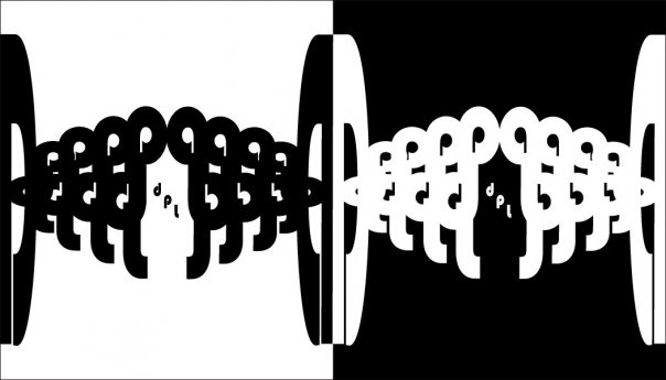
The inside cover was done in Illustrator and Photoshop, which is the combination I most commonly use. The squares were simply colored and arranged, while the silhouttes were made in Photoshop and imported in. That font is called "Calvin & Hobbes", and it's made to look like the title font from the strip.

I read Calvin & Hobbes somewhat regularly, and I always enjoyed Watterson's illustration. But now that I've spent a good deal of time on this project, I would like to read even more of the strip. I hope you all like it too.

Friday, January 22, 2010

A simple but classy Nail Salon logo


Click the logo for better resolution.

This is a logo for a future nail and beauty bar. It was done relatively quickly; it wasn't a real challenge, since I'd been given the font to use by the client, and the color scheme too. The oval was my idea. It was all done in Illustrator.

Wednesday, January 20, 2010

The South Bronx FC Season 12 poster


For those that don't know, I play in a Wednesday night soccer league. I wouldn't say we take the league more serious than the other teams, but we do put a little more effort into being there, which is why we're the only team in our division, and maybe the entire league, that has jerseys w/our names on the back, and not even our real names, usually.

Besides that, I've been making online flyers to promote the games. It hasn't really worked; only our best friends and an occasional acquaintance ever comes, but it's still fun to make flyers for our online fan pages on Facebook, Myspace, and Twitter. Here's the newest one that I've done for our 12th season, a teaser poster showing our mascot, Igoo from the Herculoids cartoon from the 60s.

The flyer was done mostly in Photoshop, but the text and the text background were done in Illustrator. I was originally planning to use teammates, but most of the pictures of us were too low-resolution at the size I needed them to be. But this way, the entire team is represented. Anyway, let me know what you think.

Sunday, January 17, 2010

Logo work


This is a logo I did. "DL" are the 1st and maiden name initials, and "M" is the last name. She's a journalist, so I used Times Bold for a professional feel, but I used a simple ring around the text to make it look a little more interesting. I thought that it was visually appealing, but didn't stand out to the point of being inappropriate for the sort of business setting that working at a newspaper entails. I appreciate any critiques.

Friday, January 8, 2010

Project:Gold unveiled


You all should feel special. I haven't even sent the (simple) revisions back yet to the DJ. But it's ready to go; he just reminded me that I hadn't put my contact information on it. He's a versatile DJ, plus a good, thoughtful person. His birthday was on the 5th, so I'm glad he liked the project. Just one more thing that went good for him this week. "Magic Gold" is a dance-themed cd. I got to hear the mix while discussing ideas w/him, and the idea that you see was very strong in my mind very early on, once he told me what the project was about. I'm working on two more pieces with him, plus a possible book cover, so expect to see more artwork in this space, soon.

Thursday, January 7, 2010

Hylandaz Redux artwork


I didn't like the front at first, but then I did, so here it is. The idea was loosely inspired by "Apocalypse Now" as well as by the original "Hostile Takeover" artwork. Doc, who makes beats for the album (he's the same Doc of the Single Minded Pros-if you haven't heard them, don't kill yourself, just listen to the music), loves "Apocalypse Now," hence 'Redux'. I have an electronic copy of the album from Doc, and it has new songs added along with a new song order.